How to Design an Effective Dashboard: Key Principles
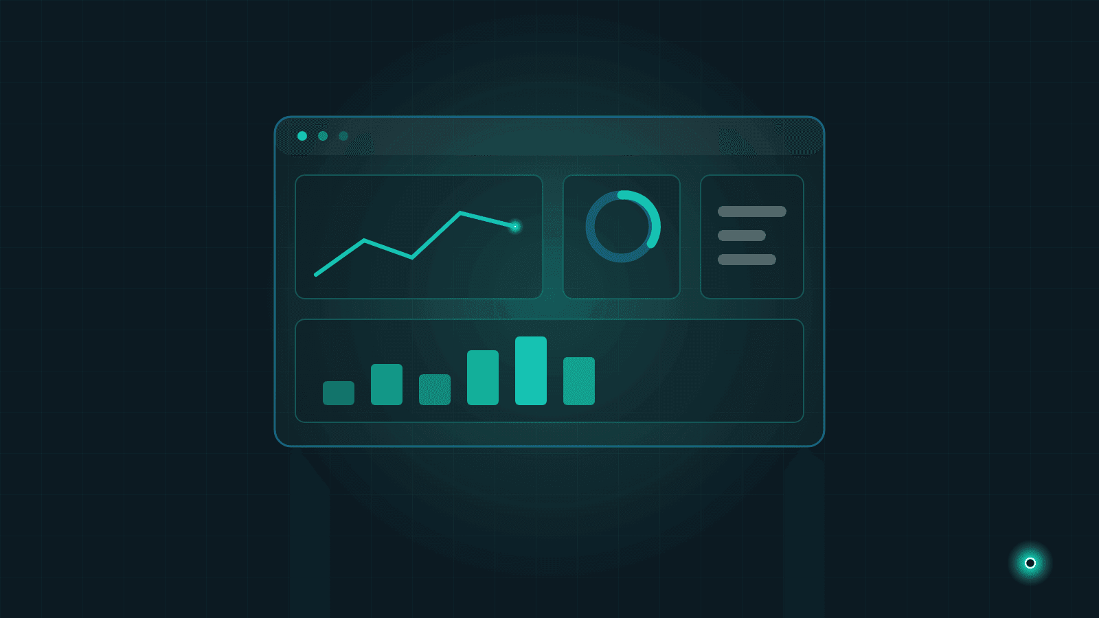
A dashboard exists to answer your company's most critical questions in seconds. Where are sales against target? Which product is running out of stock? Are overdue receivables growing? When the answers are scattered across five spreadsheets and three different systems, a well-designed dashboard shines a light on exactly that mess.
Yet in many companies, dashboards fail at this job. Screens are packed with colorful charts, while meetings still get stuck on "which number is the right one?" The problem is rarely the technology — it is the design: nobody defined up front which questions the screen should answer.
In this guide we share practical dashboard design principles: choosing the right metrics, picking chart types, using color and hierarchy well, deciding how often data should refresh, and avoiding the most common traps. No technical background required — the goal is to help you ask the right questions when talking to your team or your software partner.
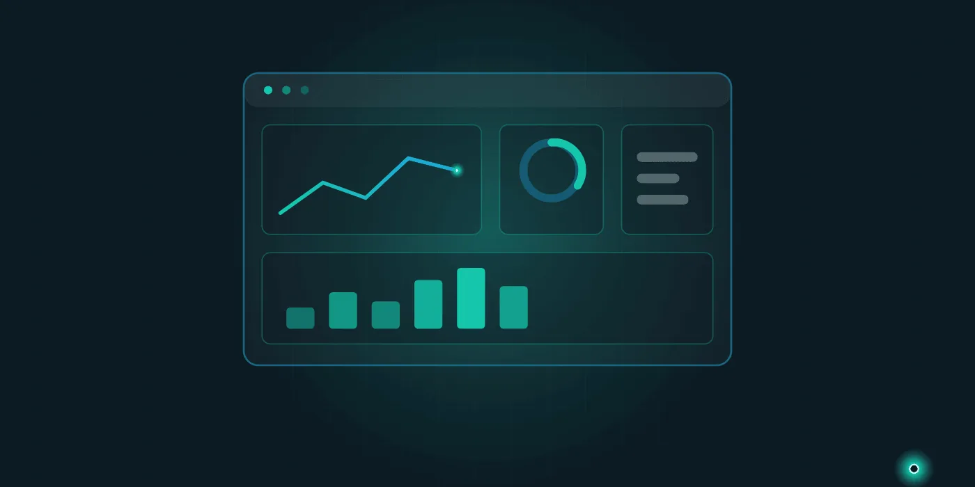
A Dashboard Is a Decision Tool, Not Decoration
The best analogy is the dashboard in your car. The vehicle runs hundreds of sensors, but the panel shows only speed, fuel, and a few warning lights — because its purpose is not to display data but to support your driving decisions. The same standard applies to a business dashboard: every chart on the screen must map to a decision. If there is no answer to "what will I do when I look at this chart?", that chart is decoration.
This leads to the "answer at a glance" principle: whoever looks at the screen should understand within a few seconds whether things are going well or badly. If they have to read numbers one by one, do mental math, or open another file, the design is not doing its job.
A good dashboard answers questions; a bad dashboard creates new ones.
A dashboard is the visible face of business intelligence. If you are curious about the approach behind it, see our post on what business intelligence is and what it delivers.
Fewer Metrics, Clearer Answers
The most common trap is clutter. The "we have the data, let's show all of it" mindset produces screens where everything looks important — which means nothing stands out. A practical rule: 3 to 5 critical metrics per screen. Everything else belongs on a second screen or in drill-down views that open on click.
Which 3 to 5 metrics? The answer depends on your business, but the selection criteria do not:
- Tied to a decision: When the metric worsens, it should already be clear who does what.
- Early warning, not just outcome: Track not only results (revenue, profit) but also the indicators that predict them (quote count, return rate, pending orders).
- Clearly owned: Assign a person or team responsible for each metric.
Role separation matters too: the owner's screen and the warehouse manager's screen should not be the same. Instead of showing everyone the same crowded view, give each role its own 3 to 5 metrics. We covered data's role in decision-making in more depth in why data-driven decisions feel hard.
Choosing the Right Chart Type
The essence of data visualization is matching the shape of the question to the shape of the chart:
- Change over time (trend) → line chart. "How are sales trending month by month?" is answered by a line; direction and slope read instantly.
- Comparison across categories → bar chart. For "which product, which region, which salesperson?", comparing bar lengths is the easiest visual task there is.
- A single ratio or value → one big number. Do not bury a single figure like target attainment in a chart; display it in large type with the gap to target and the change versus last period next to it.
The limits of pie charts
A pie chart suits only one question — "parts of a whole" — and becomes unreadable beyond three or four slices. The human eye is poor at comparing angles; telling two similar slices apart is nearly impossible. If comparison is the goal, a bar chart is almost always clearer. Three-dimensional pies make everything worse; avoid them.
Color and Hierarchy: Guiding the Eye
Color is a language, not decoration. On a good dashboard, colors carry meaning: red says "attention", green says "on track", gray says "neutral context". Giving every chart its own rainbow breaks that language. A practical approach: calm gray tones for the background and supporting elements, one vivid color for the single thing that needs emphasis.
Hierarchy follows the same logic. The eye starts reading at the top left, so the most critical metric belongs there, at the largest size. Supporting charts sit in the middle; detail tables go at the bottom. Do not fear white space: a screen that breathes reads faster than a screen stuffed to the edges. Finally, give every number context — the gap to target, the change from last month. A context-free "1,250,000" says nothing on its own.
Real-Time Data or Daily Refresh?
"Make everything real-time" sounds appealing, but it comes at a cost: live data demands more complex infrastructure and tighter system integration. The right question is: how quickly can I actually act on this data?
- If production-line stoppages, a call queue, or minute-by-minute stock levels are critical, live or hourly data makes sense.
- For monthly sales performance, receivables aging, or profitability, a daily or even weekly refresh is more than enough.
A hybrid model works too: on the same screen, some cards can be live while others are calculated overnight. And remember, data reliability comes before refresh frequency. If your source data lives in scattered spreadsheets, firm up the foundation first — our post on moving beyond Excel spreadsheets can help.
Common Mistakes and the Questions That Prevent Them
The five most common dashboard mistakes
- Cramming everything onto one screen: A screen with twenty charts is twenty unanswered questions.
- Flashy but unreadable charts: 3D pies, nested donuts, and needless animations hide information instead of revealing it.
- Numbers without context: A figure shown without its target or prior period invites guessing, not interpretation.
- Untrusted data: If the number on screen contradicts the one in accounting, the team stops looking at the dashboard — rightly so.
- No routine around the screen: A dashboard that is never opened in the weekly meeting and never cited in decisions gets forgotten.
Five questions to ask before designing
- Which concrete questions will this screen answer?
- Who will look at it, and how often?
- When a metric turns bad, who does what?
- Which systems will the data come from, and how current and reliable is it?
- How will we know it worked — which decision will be faster because of this screen?
If these answers are clear, half the design is already done. The rest is the right tooling and an experienced implementation team. If you plan to bring in outside help, the preparation steps in before requesting a software quote will make the process smoother.
At Lumethis, we build data analytics and business intelligence solutions for SMEs. You can explore our services and see how we approach similar work on our projects page. If you would like to talk through your own dashboard, reach out via our contact page — we will look at your existing data together and map out a realistic path forward.
Need help with this topic?
Contact Us